When you design a website keeping in mind the hardware and software requirements, business objectives, out of the box features, then you are bound to fail because you are missing out on one very important angle – ‘users’.
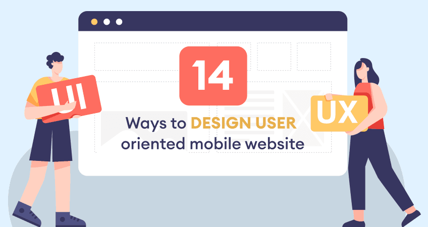
That is not it. By doing this, you are breaking the most important rule of web design: Designing the UX (User Experience).
To achieve this, it is very important that you incorporate usability & usefulness of your website, through an interactive and intuitive UI (User Interface) design. There are many factors, which collaboratively contribute.
In simple terms, usability refers to the ease of website use, and usefulness refers to the website relevancy, from a user’s perspective.
Henceforth, when building a website, be aware of the satisfaction factor and the perspective thinking of the users.
Visibility has to be the key
Navigational elements play an important role in guiding a user what exactly to do and how to go about, when a website is visited.
This makes it highly simple for users to figure out what is in store for them and how much information is relevant to them. Thus, visibility acts as a key to open the door of a website.
Minimum load of memory always helps
It is very difficult for users to navigate a website with too many website components redirecting towards multiple pages affecting user’s memory largely.
It becomes very difficult for users to remember as well as locate relevant pages and items.
Hence, keep your site memory as low as possible with minimum useful website real estate, which are consistent and have a definite purpose to solve through the whole website.

Instant feedback promotes communication greatly
Things can become faster when a website is centered surrounding the users. Instant feedback is one of the best ways to do so.
If users are stuck at some places, an immediate integrated help accompanying the user actions, can actually tell users what exactly to do when clicking a button, provoking a Call to Action, or registering with the site, etc.
Accessibility should be smoothly ‘accessible’
Retrieving information is expected to be quick and efficient. Henceforth, accessibility can take various forms such as starting from a basic search feature, to an entire sitemap.
Even overall web content can be broken down to digestible sections that make sense to the users, as well as skimming the unwanted text, are another few ways of achieving an easy accessibility.
Site orientation keeps the website organized
Orientation of pages within a site is managed by installing navigational clues everywhere.
Most of them include integrating a site map, putting descriptive links, incorporating site elements that tell users their location within a website and relative to other website pages.
Many designers nowadays take sitemap for granted, but what they do not realize is it is still the most effective source of site orientation.
Increase the speed of your mobile-friendly website
It’s quite obvious that no one likes to wait for ages while loading a webpage. A recent study says that roughly half of the users go away from the website if it takes more than 3 seconds to load.
In case, you have a WordPress website then you can install plugins to boost up your website speed. Plugins such as WP Super Cache, W3 Total Cache, and many more are readily available.
Make forms easier
Forms are something that we all hate to fill and our hatred is multiplied if it’s a lengthy form.
Mobile app designers responsible for the development of mobile web application must consider this and try to come up with an easier way to access their information.
While designing forms you must ensure that you include only those fields or categories which you absolutely need.
In addition to that you can make the submit button large, bold, so that it catches the eye of any user thus making the process of filling form easier.
Keep the writing clear and concise
When it comes to the web development for mobile the developer needs to keep in mind several things. It’s because the screen of mobile devices is small as compared to any other device.
Therefore, the size of the fonts becomes important. You can’t keep large fonts as that would fill the entire screen or too smaller fonts that would require a user to zoom multiple times.
To make a website mobile friendly you must understand the usage of small and big sized fonts.
According to the experts the font size of the title should be double to that of body font size. Similarly, the size of subheadings must be 1.625 times the size of body font.
Importance of ‘search option’
The ‘search’ option is important in any website. It’s a key element that enables both accessibility and navigation. Moreover, when it comes to user-friendly websites for mobiles it becomes even more important.
It’s because the smaller screen size of mobile is unable to accommodate all the content, due to which your site relies heavily on ‘search’ option. Moreover, you don’t want to lose a customer just because they were unable to find what they wanted.
Summarize your content
Blogs and articles are the main source of information for your website. They are the source that might have the information that the user is be looking for.
But if your blogs and articles are not placed well then, the user might get lost. Hence, it’s necessary that you categorize all your content in an archive option.
Pleasant viewing leads to clear interpretation
When a site is simple enough not just to use at but also to look at, it leads to higher chances of interaction between the website and the users.
After all, the more a site interface entices the users, there is a higher probability that user dependability, and confidence on the site increases.
The logic here is simple. Simplicity leads to user friendliness, which in turn leads to motivation.
Design needs to be visually appealing
A design, which is visually attractive, enhances the overall aesthetics of your user interface creating a mesmerizing user experience.
The most important aspects associated with this are way of representing information, overall website tone, font, color, placing, structure, and more.
Highlight your calls to action
It’s important to understand that people navigate differently in a mobile website than that in desktop. In mobile the users have a goal-oriented approach and they want to find things quickly without any delay.
In such case, you have to provide them a path so that they follow it to find what they want. These paths can be in a form of Call-to-actions that will ultimately help you to increase your conversion rate.
You can achieve this by making your landing pages constructive which is not a rocket science.
You just need to have simple yet effective CTAs like “subscribe��”, “buy now”, “get a quote”, and many more. To draw user’s attention to the CTAs you can use colors which are easy to notice.
Design finger-friendly touch targets
To make a user-oriented mobile website it’s important to have the tap buttons of appropriate size. The average size of fingertips is in the range of 8-10 mm which makes 10mm x 10 mm a suitable target size.

Another aspect that you must keep in mind is the spacing between the different buttons.
If you place all your buttons too close to each other then it may cause your user to accidentally tap on the wrong button. This might frustrate the user as he/she is unable to tap on the intended button.
You can avoid this situation by having tap buttons of suitable size with appropriate spacing between them. Below is the suggested distance between the two touch buttons.
Next time…think about the ‘users’ first
Most designers design professionally not taking into consideration, the user expectations. That results in users getting frustrated with a website that is difficult to navigate.
Being associated with an average website can actually end the career of the responsible designer.
Hence, it is very important for every designer to crosscheck a website not once or twice, but multiple times on the above discussed parameters.
A good design requires hell lot of time from start to finish requiring a great deal of patience and steadiness.
Just remember that a website can fulfill the owner’s goal, only with user’s participation and involvement.
Therefore, it is the sole responsibility of both website designers & developers and digital design agency to make the whole experience as soothing as possible.